Tuesday, 5 November 2013

Final Outcome 'Identity and Self'


For my Final Outcome of this Identity and self-project I decided to develop my accessorise concept further as it was inspired by body dismorphia, eating disorders and feeling uncomfortable in my own body. As there are things that I have really struggled (and still somewhat) struggle with, I thought that I would be able to create a very in-depth and personal response to this theme. 


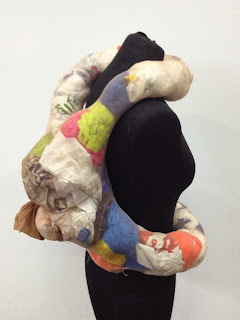
I added more layers of tights stuffed with plastic bags to my accessory, until it looked like the mannequin was engrossed and trapped in rolls of soft flesh.  I was thinking of covering it with flesh coloured fabric, but I then decided that this ruined it, as it covered the interesting colours and patterns off the plastic bags, and the deep folds and crevices. 

For my photoshoot for this piece, I created a virtual environment loosely inspired by the inside of the body by draping pink and white sheets and fabric, over display boards and across the floor. Pinned them together to make them look like they were all part of the same piece. Everything was very soft and textural, and to add even more contrasting textures, I added cling film and bubble wrap. Before the shoot I did a few test shots to see what the piece looked like in the location and I thought it fitted in very well with its soft, fleshy surroundings.


I wanted to make my garnet the main focus of the shoot, therefore the outfits that I put it with were quite simple. I put the model in a floaty, white asymmetric dress paired with squidgy, transparent jelly shoes, which fitted in with the soft organic feel of the garnet and set. I varied this outfit with two different cream coloured jumpers- one a fitted ribbed roll-neck and the other an over-sized, chunky cable-knit. This gave a variety different contrasting  shapes, silhouettes and textures. I experimented with some very unusual accessorise and props, such as putting tights on the model's head, tieing rope around her neck and wrapping her hands in cling film. This not only added more interesting textures, but was a symbolic suggestion of feeling trapped and uncomfortable in your own body.


I chose my friend Eloise to be the model for my photoshoot as her red hair and pale-pink complexion really complimented the soft pink colour scheme of the mise-en-scene. She also had experience with Yoga and and Gymnastics, which meant that she was quite flexible and could preform interesting poses. 
I was planning to do range of shots with standing, sitting and lying poses, but unfortunately Eloise was too tall to fit into the backdrop therefore I was only able to do sitting and lying poses which encouraged me to be even more inventive. I captured a few basic sitting poses to show clear images of the piece, but also did a lot of odd foetal poses and twisted lying poses.  

When editing my photos I upped the brightness around 25% to achieve an very overexposed, hazy, dreamlike atmosphere. I also used the blur tool around the edges of the figure to enhance this effect. 

Overall I am very happy with my final outcome of this project. I think that its is very unique and personal too me. If I would have ad more time, I would have also liked to produce a video featuring this garment about the issues surrounding eating disorders and what its like to struggle with them in a conceptual way.

Week 5 Styling

The first brief for styling week as to take a series of 'photobooth' style photos, inspired by the way people used to muck around in photo booths for fun, when you were allocated 4 different shots. The only guidelines were that they had to reflect your personality in some way, using different clothing, accessorise and facial expression to portray a sense of identity.

I have always been interested in pop-art and the Beatnik art culture of 1960-70's New York so chose I based my shots around some Polaroids of Andy Warhol and Debbie Harry. I noticed that subconsciously, my overall look personal style is quite similar to that of these two people as I have very pale skin, sharp cheekbones bleach blonde hair and often wear black roll-neck tops.


I chose to do the shoot in front of my bedroom curtains which have a New York Skyline printed on them. This is not only a reference to the New York based Beatnik art scene, but New York is also my favourite city in the world (that I have visited so far). I went there for a few days last February with my dad and it was one of the most incredible experiences of my life, I fell in love with New York and now my life ambition is to move there one day, so this backdrop is very personal to me. 

The significance of the shots were I'm hiding my face with my hair or the jumper symbolises how I sometimes feel shy and insecure, particularly in front of a camera. The shots where my whole face is exposed, with no make-up and my hair tucked into my jumper represents my true natural self. The shots were I am wearing red lipstick and/or sunglasses represents how we often use clothing, accessorise and make-up to convey our personality to others, or even mask our true self. The red lipstick symbolises trying to look sexy and attractive and the sunglasses represent trying to look 'cool', which seem to be the most desirable characteristics in today's society. 


As well as this I had to produce a 'trend report' based around either high-street, high-end or underground street trends. I visited Oxford Street, therefore focused on High Street trends and also managed to take a few street-style pics. I focused on wide variety of High-Street stores including Topshop, Urban Outfitters, Zara, Cos, All Saints and Office. The main trends that I noticed emerging for A/W13 were punk-inspired tartan, acid-wash/ripped denim and chunky soled shoes, roll-neck and fluffy jumpers, masculine tailored coats, all black silhouettes, leather skirts and bomber jackets.


As a final outcome, I had to produce a photoshoot. To design a concept for my photoshoot, I took elements from my 'Photo Booth' style photos (the hair tucked into the black roll-neck), my 'Trend Report' (all-black silhouettes, masculine tailored coat, leather skirt and bomber jackets. I also took inspiration from an exhibition that I saw at the ICA during the summer, about a cutting  1990's New York based art/fashion collective with a raw, quirky yet minimalist atheistic. 

These are the mood boards that I created to inspire my photoshoot:

Location and Props:


I wanted to use a very urban yet clean and modern setting as a reference to the futuristic aesthetic of many fashion photoshoots and campaigns of the late 1990's. For the location, I chose the River bank round the back of college and the Millenuim Dome, partly because it fitted in with the type of location that I wanted, and also because the area is symbolic of the turn of the New Millennium. 

Mood and Lighting:


I wanted to achieve a hazy, over-exposed feel like the 90's photographers Corrine Day and (my favourite) Wolfgang Tilmans and Jeurgen Teller's recent adverts for Celine. I really liked the contrast between the raw over-exposed look look and the very sleek polished clothes that Teller Created. During the shoot, I made the most of the natural white-light from the grey, cloudy London sky the create this effect. 

Styling:


As well as keeping to the very sleek 90's minimalist aesthetic, I also included some items of clothing that are very personal to me such as my favourite black neoprene jumper and my celtic style pentagram necklace, which added a sense of personality and a very slight 'sporty' and 'goth' feel. I also directly referenced an image from the Bernadette Corporation which features two back-packs overlapping against a white jacket. I thought this was a very unusual idea and wanted to try it out for myself. Whats more, I am know amongst family and friends for carrying an often excessive amount of bags with me, and am nicknamed 'the bag lady'.  

Hair and Make-Up:


As well as tucking the hair into the roll-neck, I also slicked in back for a very clean, sleek modern look. I went for minimal make-up with a natural glow to keep the overall feel very fresh. 

Casting:  


I chose my friend Grace as a model as she is very fresh, faced, delicate and doll-like, with striking features such as her big eyes and high-forehead.  She also had straight dark hair in centre parting which worked well with the hair-style plans that I had.

These are my favourites from the shoot:


And the final 2 shots:


I chose these two shots as I could really see them on the cover of a high-end magazine editorial. I chose two very different shots in both colour and black and white to make it interesting to the viewer. 

I was really happy with how the shoot went, and felt that it really conveyed my personality and style.


Week 4 Accessorise

To develop a concept and design for my accessorise, I took inspiration from my favourite accessorise - my pale pink beanie hat which used to wear so often it has almost become a distinctive feature of mine among those who know me well. However, I challenged myself to produce something very different with it as an outcome - and defiantly not another hat!

In order to look at my beanie in a more unusual way, I experimented by scanning it in different, scrunched up positions, to make it appear more abstract.  I then noticed that the soft, organic, pale pink shapes that I created mirrored human flesh and organs, and decided to use the body as inspiration.


This theme is very personal to me, as I have struggled with eating disorders and body image issues in the past, therefore I have a difficult relationship with my body and my physical self.

My initial accessorise designs, where meant to look like strange, ugly bumps on the body and rolls of flesh, which were inspired by feeling unhappy with your shape and size, feeling to big in certain places.  I made them look extremely disproportionate to the rest of the body, to represent how flaws are often very exaggerated a distorted in the mind of somebody suffering from body dismorphia. I was inspired by a sculpture that I saw at the Welcome Collection recently; very cleverly entitled 'I cannot help the way I feel' (John Isaacs 2003), based on an obese figure, but faceless and so grossly fat and out of proportion, that it no longer looks like a human body, just a mass of soft flesh'.  I was also inspired by a Comme des Garcons Collection which I saw at an achieve exhibition at the Barbican a few years ago. That particular collection just stuck in my memory as it was so unique and innovative. It was entitled 'Lumps and Bumps' (S/S 1997), which took inspiration from Victorian bustles to create silhouettes with odd contours.


To represent that this was  Another concept which I explored was accessorise which looked like jutting bones, which portrays the reality of what suffers from eating disorders often look like, despite feeling too big. I made them very sharp to show the dramatic contrast between the the two designs - one representing a delusion, the other showing the reality. After experimenting with paper models on the stand, I chose to create the fleshy design in the end as I thought it was more unique and original.


I decided to use tights and plastic bags as the materials for constructing my accessorise and they were very easy to mould and manipulate into the organic shapes that I wanted to achieve. I was inspired by the work of the YBA Sarah Lucas, who often uses tights to create provocative and interesting sculptures inspired by the body.


I thought about covering it with fabric to make it look more finished and more like flesh, but I decided I really liked the interesting colours and patterns of the plastic bags showing through. The finished accessory also remind me of the digestive system, which is another think to the concept of eating disorders and the body.

I did a quick photoshoot for this accessory in the garden, using my little sister as a model. Although she is very beautiful, she is curvy not thin. I chose to use her as a model to show a more realistic body shape, rather than a perfect model, as this piece represents flaws in the body and how they are often exaggerated by the mind. After the shoot, my sister complained that she looked 'fat' in the photos, which to me meant that my accessory was successful.


I wanted to use a simple location to allow keep the main focus on the accessory so I chose a my park, which has a wall with white graffiti on it which I thought would also make an interesting background.
Unfortunately, as I had to do it after my sister got home from college, it was already starting to get dark, which meant that in order to for the photos not to be too dark, I had to set the camera to a long exposure, which meant that the photos came out a bit blurred. However, I made this work to my advantage in the end by shaking the camera to exaggerate the blurred affect almost making it look like double vision, which made the quite basic photos look a lot more interesting and added a ghostly, ethereal feel.