In order to look at my beanie in a more unusual way, I experimented by scanning it in different, scrunched up positions, to make it appear more abstract. I then noticed that the soft, organic, pale pink shapes that I created mirrored human flesh and organs, and decided to use the body as inspiration.
This theme is very personal to me, as I have struggled with eating disorders and body image issues in the past, therefore I have a difficult relationship with my body and my physical self.
My initial accessorise designs, where meant to look like strange, ugly bumps on the body and rolls of flesh, which were inspired by feeling unhappy with your shape and size, feeling to big in certain places. I made them look extremely disproportionate to the rest of the body, to represent how flaws are often very exaggerated a distorted in the mind of somebody suffering from body dismorphia. I was inspired by a sculpture that I saw at the Welcome Collection recently; very cleverly entitled 'I cannot help the way I feel' (John Isaacs 2003), based on an obese figure, but faceless and so grossly fat and out of proportion, that it no longer looks like a human body, just a mass of soft flesh'. I was also inspired by a Comme des Garcons Collection which I saw at an achieve exhibition at the Barbican a few years ago. That particular collection just stuck in my memory as it was so unique and innovative. It was entitled 'Lumps and Bumps' (S/S 1997), which took inspiration from Victorian bustles to create silhouettes with odd contours.
To represent that this was Another concept which I explored was accessorise which looked like jutting bones, which portrays the reality of what suffers from eating disorders often look like, despite feeling too big. I made them very sharp to show the dramatic contrast between the the two designs - one representing a delusion, the other showing the reality. After experimenting with paper models on the stand, I chose to create the fleshy design in the end as I thought it was more unique and original.
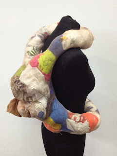
I decided to use tights and plastic bags as the materials for constructing my accessorise and they were very easy to mould and manipulate into the organic shapes that I wanted to achieve. I was inspired by the work of the YBA Sarah Lucas, who often uses tights to create provocative and interesting sculptures inspired by the body.
I thought about covering it with fabric to make it look more finished and more like flesh, but I decided I really liked the interesting colours and patterns of the plastic bags showing through. The finished accessory also remind me of the digestive system, which is another think to the concept of eating disorders and the body.
I did a quick photoshoot for this accessory in the garden, using my little sister as a model. Although she is very beautiful, she is curvy not thin. I chose to use her as a model to show a more realistic body shape, rather than a perfect model, as this piece represents flaws in the body and how they are often exaggerated by the mind. After the shoot, my sister complained that she looked 'fat' in the photos, which to me meant that my accessory was successful.
I wanted to use a simple location to allow keep the main focus on the accessory so I chose a my park, which has a wall with white graffiti on it which I thought would also make an interesting background.
Unfortunately, as I had to do it after my sister got home from college, it was already starting to get dark, which meant that in order to for the photos not to be too dark, I had to set the camera to a long exposure, which meant that the photos came out a bit blurred. However, I made this work to my advantage in the end by shaking the camera to exaggerate the blurred affect almost making it look like double vision, which made the quite basic photos look a lot more interesting and added a ghostly, ethereal feel.


No comments:
Post a Comment